Legibility refers to how distinguishable letters are, related to typeface design. Readability refers to the arrangement of text, affecting how easily it can be read.
Choosing Typefaces
Accessible typography starts with choosing the right typeface.
While no single font meets everyone’s needs, certain features enhance visual accessibility.
Serif typefaces are traditionally more accessible for long-form content, while sans serifs are more legible for digital content due to their simpler, cleaner letterforms.
Checking Legibility
An important feature to take into account is its counters, or counterform.
Counters are the negative spaces within a letterform; they can be found in letters such as “o”, “d”, “c”, and “u”, as well as “e”, “g”, and “b” as seen in the illustration. Open letters can make it easy for your audience to differentiate between characters such as “c” and “e”.
Checking Readability
Small font sizes, italicized text and all uppercase text tend to be difficult for viewers with low vision.
Readability refers to how text is arranged, affecting ease of reading. Considering ‘mirroring’—how characters look when flipped, like ‘b’ and ‘d’, ‘q’ and ‘p’, ‘I’ and ‘l’, or ‘O’ and ‘0’—is crucial. Subtle differences in these characters enhance readability and legibility.
Colors
Choosing the right color combinations is crucial, especially for those with low vision. Low contrast between text and background makes reading difficult. Contrast ratios, ranging from 1 to 21 based on luminance, should be at least 3:1 for large text and 4.5:1 for small text.
A study by Chen et al. (2020) found that green and black is the most suitable color combination for safety signs.
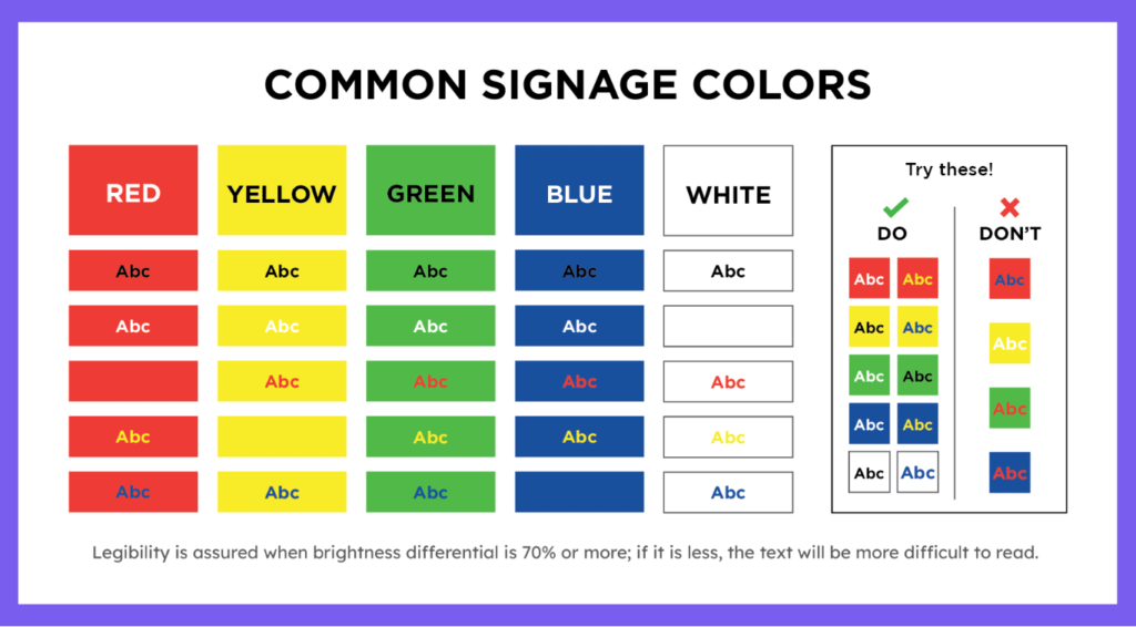
Some of the most used background colors in signages are as follows
Red: Indicates danger, commonly used for safety signs, stop signs, and traffic lights.
Yellow: Grabs attention and signals caution, often seen in wet floor signs and road signs.
Green: Signifies safety and permission, commonly used for emergency exits and traffic lights.
Blue: Conveys mandatory instructions, often used in workplace safety signs and guide road signs.
Size and Spacing
Proper text sizing and spacing are crucial for readability. Smaller fonts, italics, and all-uppercase text are harder to read for people with low vision.
Leading, or line spacing, also affects readability. If spacing is too tight or too loose, readers may lose their place in the text.