Creating Inclusive Street Signs: A Guide for Addressing Visual Impairment Needs
(The article aims to emphasize the pivotal role of consistent and inclusive signage design in fostering accessibility for individuals with disabilities. It seeks to raise awareness about how thoughtful signage can create welcoming public spaces, educate on the impact of design consistency for navigation, promote inclusive practices accommodating various disabilities, empower through understanding the importance of accessibility, and advocate for universally inclusive environments that prioritize equality and belonging for everyone.)
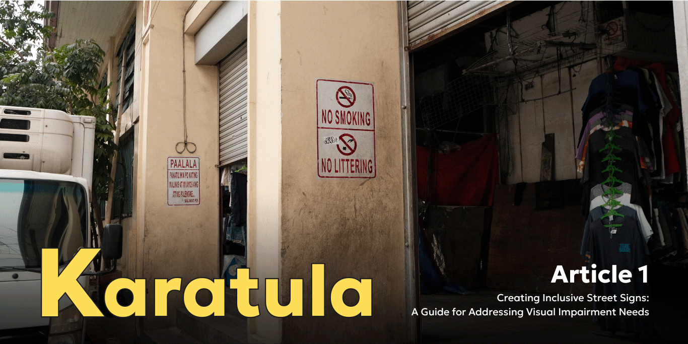
It has become vital to recognize how design informs experiences for persons with disabilities in an aware world focused on inclusivity. Signage design in the midst of pursuing welcoming and navigable public spaces for everyone is largely unnoticed as well. This article shows how continuous and comprehensive signage design is vital for creating accessible settings surrounding us.
The Strength of Consistency: Consistent signage design is not just about aesthetics, it is an important tool which helps ensure smooth experiences for people with disabilities. Think consistency like a common language that is bringing up the walls, and therefore everyone, including people with any kind of disability, should be able to walk through public places without hesitancy. Individuals develop independence and confidence as they are capable of creating a mental map of their surroundings through a uniform design language within signage.
Consistent signage is important for people who suffer from the vision defects due to its predictability in location of the message information. Imagine a situation in which bathrooms, exits, and elevators are similarly labeled among different institutions. The fact that they are able to move around unknown space makes the people with low vision have their autonomy unnoticed by the non-disabled.
Inclusive Design Perspectives: Signage inclusion goes beyond regular consistency, it welcomes the specific requirements of people with special needs. Braille signage addresses blindness while the inclusive design is broader covering issues of motion, thinking ability and deafness.
The association of textual data and uncomplicated images helps overcome communication barriers in people suffering cognitive impairment. On the other hand, contrasting colors and capital letters help those with poor eyesight. People with auditory problems could be assisted by visual cues like blinking lights or symbols, which would either provide support for original auditory messages or act as substitutes in case of auditory failure.
Crafting Inviting Public Spaces: However, the authentic impact of uniform and universal graphic signs relies on creating an atmosphere of home-like feeling and welcoming everybody. Imagine walking on the streets without worrying where to get info, nor being lost. Concise signage in public areas suggests such areas have no boundaries for persons with special needs.
Designing of consistent and inclusive signage goes beyond design principles; it is a platform for empowerment and equality. While trying to grow a diverse friendly world, don’t ignore what appear as insignificant matters such as signs. Adhering to these principles enables us to convert public spaces into welcoming areas where one can move around with ease and enjoy life in an affordable surrounding.

We are reshaping the urban landscape, addressing unique needs for low vision impairment and colorblindness. Beyond static displays, our immersive experience engages users with groundbreaking signage solutions. Join us in transforming public perception, fostering awareness, and empowering individuals with disabilities.
Experience a city where inclusivity becomes reality at Karatula.
As an artist, I wholeheartedly appreciate the insights shared in this article on inclusivity for color-blind individuals. It brilliantly underscores the significance of thoughtful signage design in fostering accessibility and inclusivity in public spaces.
The analogy of consistency in signage design being like a common language is particularly striking. Just as language enables clear communication, consistent signage empowers individuals, including those with disabilities, to navigate their surroundings confidently.
Moreover, the article emphasizes the importance of inclusive design perspectives, such as incorporating Braille for the visually impaired or contrasting colors for those with poor eyesight. Signage can transcend barriers and facilitate communication for all by considering diverse needs.
What resonates most is the idea that inclusive signage design not only promotes accessibility but also contributes to creating welcoming public spaces where everyone feels a sense of belonging.
This article reminds us that inclusivity should permeate every aspect of design, even seemingly mundane details like signage. As artists and advocates, it’s our duty to champion inclusivity, ensuring that our public spaces reflect the diversity of human experience.
Kudos to the proponents of this website for having such admirable goals and insights.